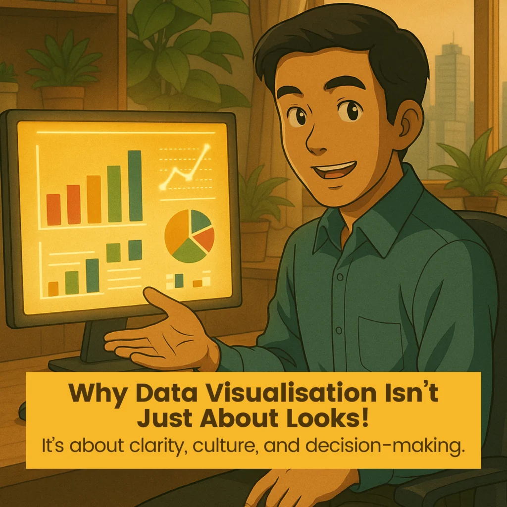
Why Data Visualisation Is More Than Just Pretty Charts
In many organisations, data visualisation is treated like window dressing, a layer of colour and charts added to make numbers look more appealing. But in reality, the core purpose of visualisation is clarity. It’s about cutting through the noise and highlighting what matters most, fast.
In the era of digital transformation and people analytics, poor data storytelling doesn’t just frustrate. It delays action. It misguides leadership. It contributes to costly misalignment across departments.
Let’s explore the telltale signs that your current data visualisation approach might be broken, and why fixing it could be the smartest decision your team makes this year.
Your Reports Look Like Dressed-Up Spreadsheets
If your dashboards are nothing more than coloured Excel sheets, you’re not visualising. You’re formatting. A real visualisation should simplify complexity and reveal relationships between data points. If someone still needs to explain the chart every time, the chart isn’t working.
You Spend Hours Manually Cleaning Data
Before you even get to the visuals, your team might be stuck fixing broken formulas, reconciling files, or tracking down missing entries. This signals poor data architecture. When raw data needs extensive manual cleanup, it introduces errors and delays, creating a fragile foundation for any insights that follow.
Your Charts Are Static, Not Interactive
A one-size-fits-all bar graph won’t answer every stakeholder’s question. Modern tools like Power BI allow users to drill down, slice by region, or filter by department. Static visuals kill curiosity. Interactive visuals encourage discovery.
Your Dashboards Have No Narrative Flow
A dashboard without story is like a meeting without agenda. It’s confusing and directionless. Effective visualisations guide the user through a logical path, from overview to detail. They answer “So what?” before the question even comes up.
Your Insights Are Trapped in Local Folders
Are team members emailing PowerPoints? Saving different versions of the same file? When insights live in silos, collaboration dies. A cloud-based, permission-managed data system keeps the entire team looking at one version of the truth in real time.
Your KPIs Are Built on Gut Feel, Not Logic
If nobody remembers how the sales target was calculated or why a certain threshold was chosen, your KPIs lack integrity. Every metric should be traceable, logical, and aligned with business goals. Without that foundation, data becomes a guessing game.
Your Data Is Siloed Across Teams
Marketing uses one dashboard, HR another, and Finance a completely different system. This leads to fragmented strategies, misaligned decisions, and missed opportunities. Cross-functional visibility allows leaders to see the big picture and act accordingly.
Why This Matters More Than You Think
Poor data visualisation is not a technical glitch. It is a cultural barrier. When visualisation fails, teams make decisions based on outdated assumptions, isolated reports, or incomplete understanding.
But when done right, data visualisation becomes a strategic enabler. It encourages teams to:
- Think critically
- Collaborate across functions
- Align on what matters
- Act faster and smarter
You move from being data-rich and insight-poor to truly data-driven.
Browse more training at Malaysia’s First-Ever Training Marketplace.
Explore workshops, certification programmes and practical courses that tackle the real challenges teams face.

